
Creating actionable Fintech products
Introduction
Project overview
Directed the product design for 3 Fntech apps. Evolved design and development processes to decrease time to market. Validated user flows by interviewing and testing with subject matter experts.
Timeline
January 2022 - May 2022
My Responsibilities
UX and UI Design, User Research, User Testing, User Interviews,, User Flows, Affinity Mapping, Wireframes, Prototyping
Tools used
Figma, Power BI, Adobe CC, Usertesting.com
Brief: I was hired to design a virtual general manager application in the vending machine industry. The product owner had a clear vision for this program and the problems it solves. This app is created for business owners that receive large amounts of data from their vending machines and computer systems. Virtual GM aggregates this data and presents it clearly. As it learns how the business operates. It also suggests tasks based off revenue predictions. I designed the UI from scratch. The entire team consists of four people, the product owner, two software engineers, and myself as the UI designer. This is a part-time project that has lasted 7 months.
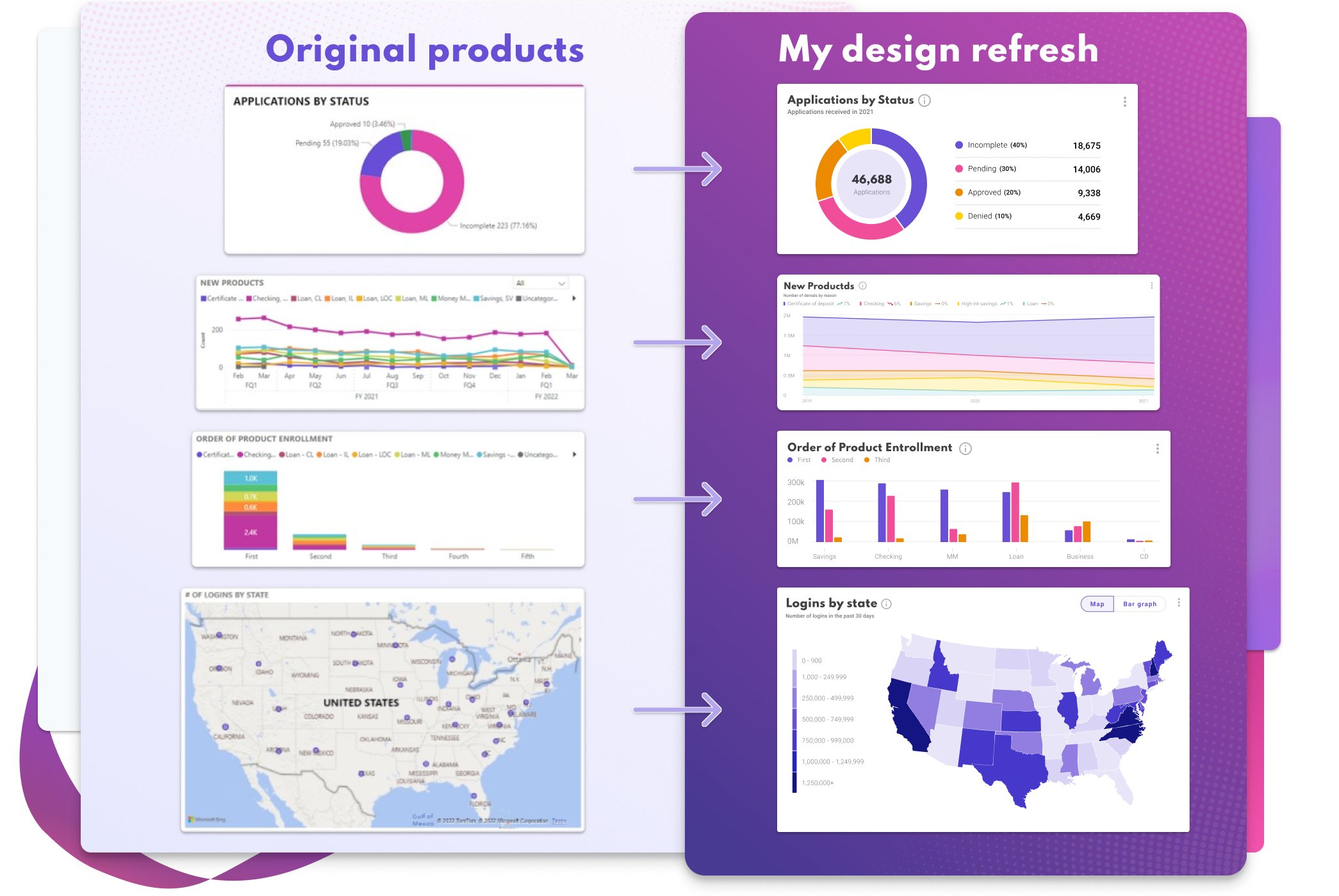
Unifying Products
One challenge Finastra had was a family of data products that didn’t match. I refreshed the design for these data visualization components to unify brand consistency. After each card had a similar look and feel, I tested them with 10 participants. The testers used an A and B version of each chart and were asked data comprehension questions. After iterating on these designs, I presented my observations to the rest of the UX team. These refreshed components helped update the design system. We also used them in our new product template.
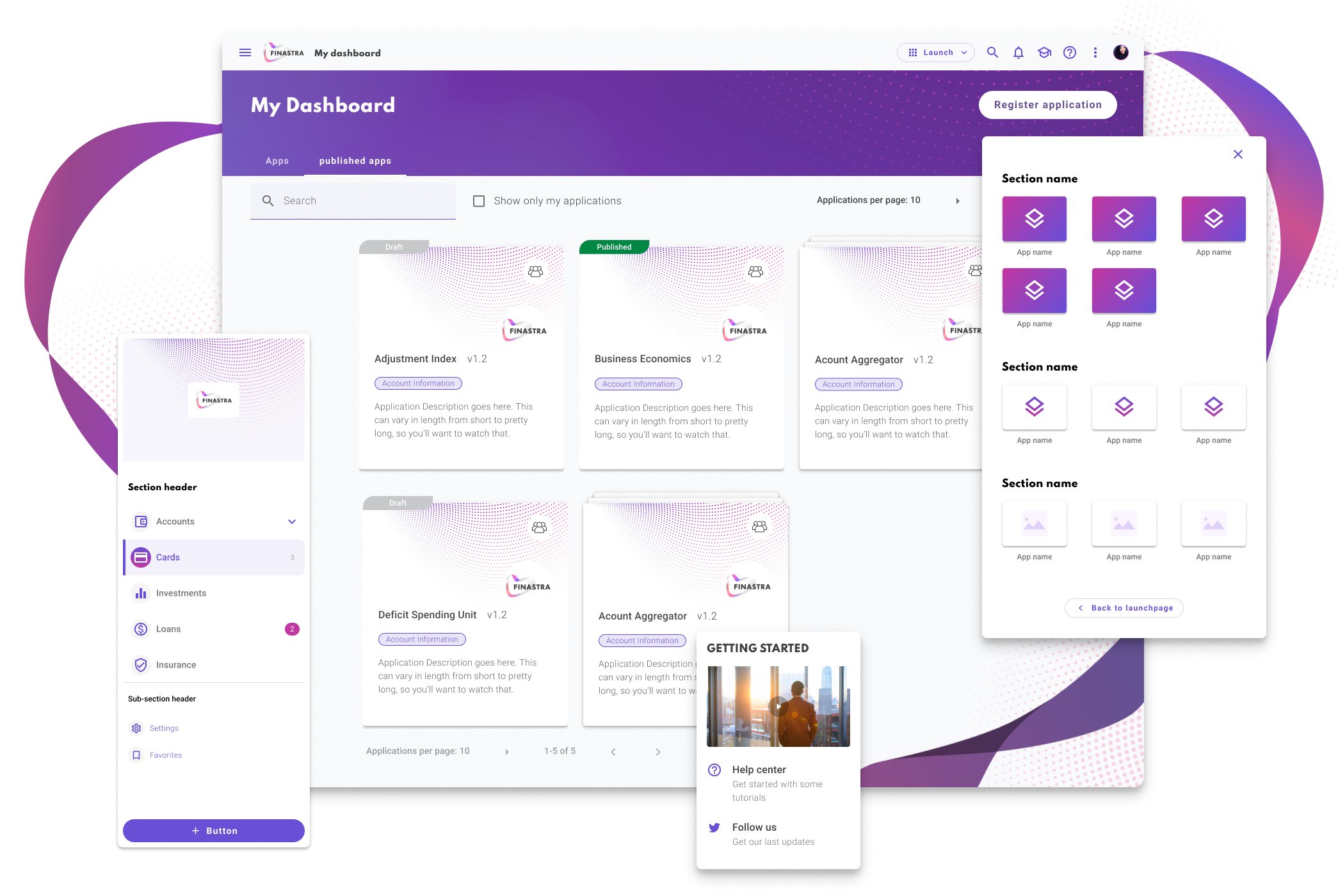
Launchpad
The purpose of my contract was to design this launch page that helps users navigate Finastra solutions. This work only took a few months. With the extra time, I built user flows for a new product and optimized our development process.
Improving Our Internal Process
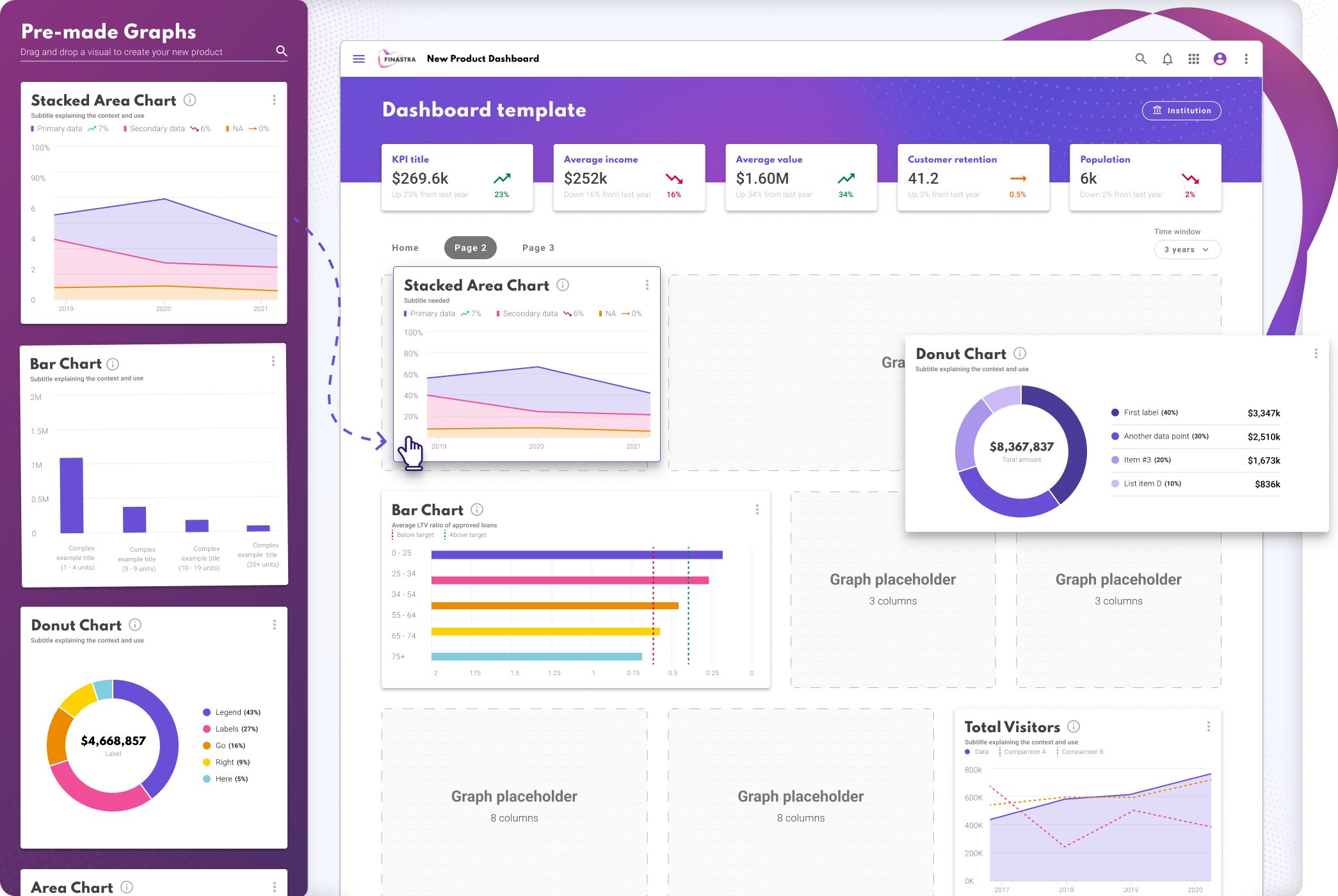
I noticed a pattern in our development cycle. Two of my projects were developed with Power BI. After giving version one to our Development team, they came back with discrepancies between the design and final product. Reworking these as intended was a lengthy process. If the product had 5 bar charts and that chart had a mistake, the fix would have to be made 5 times. One change for each chart on the page. These changes began taking over 50% of our development time. Unfortunately, Power BI doesn't use CSS or components to propagate changes across the whole product, so our regular workflow needed to be improved.
My solution was to create a Power BI file with all the elements and graphs we used. Every font, color, and spacing was set precisely and double-checked. Now developers copy and paste the pre-made components into their project. This continues to save developers time as they avoid minor UI problems. It also frees the design team to focus on user research, ideation, and testing.
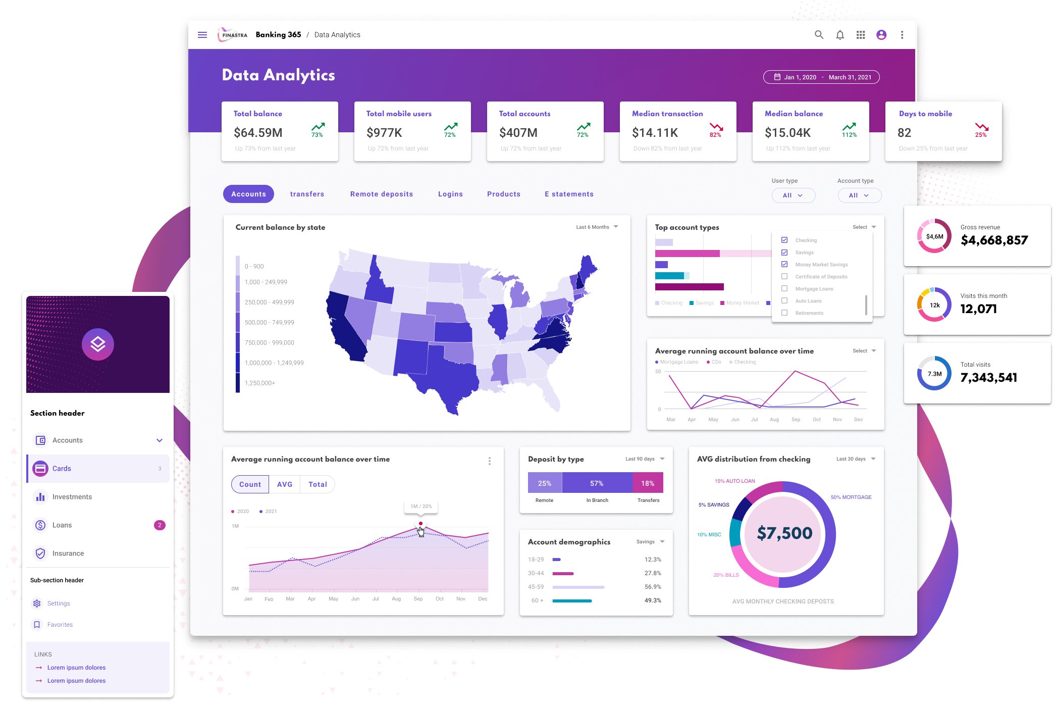
Final Dashboards
This is an example of one of the products I helped create. The same design format was used in two other apps and moving forward.
Disclaimer: Legally, I cannot share my exact designs. This is a generic representation of the dashboards I made for Finastra.

