
User Interface design for a vending business management app.
Introduction
Project overview
Created “Virtual GM” an application for vending business owners. Designed to help them quickly understand how their business is doing and keep track of their employees.
Timeline
November 2020 - Present
My Responsibilities
Information architecture, UI Design, prototyping, and front-end development.
Tools used
Figma, Webflow (HTML & CSS), JavaScript, Jquery and Vue js.
Brief: I was hired to design a virtual general manager application in the vending machine industry. The product owner had a clear vision for this program and the problems it solves. This app is created for business owners that receive large amounts of data from their vending machines and computer systems. Virtual GM aggregates this data and presents it clearly. As it learns how the business operates. It also suggests tasks based off revenue predictions. I designed the UI from scratch. The entire team consists of four people, the product owner, two software engineers, and myself as the UI designer. This is a part-time project that has lasted 7 months.
Insights & task creation
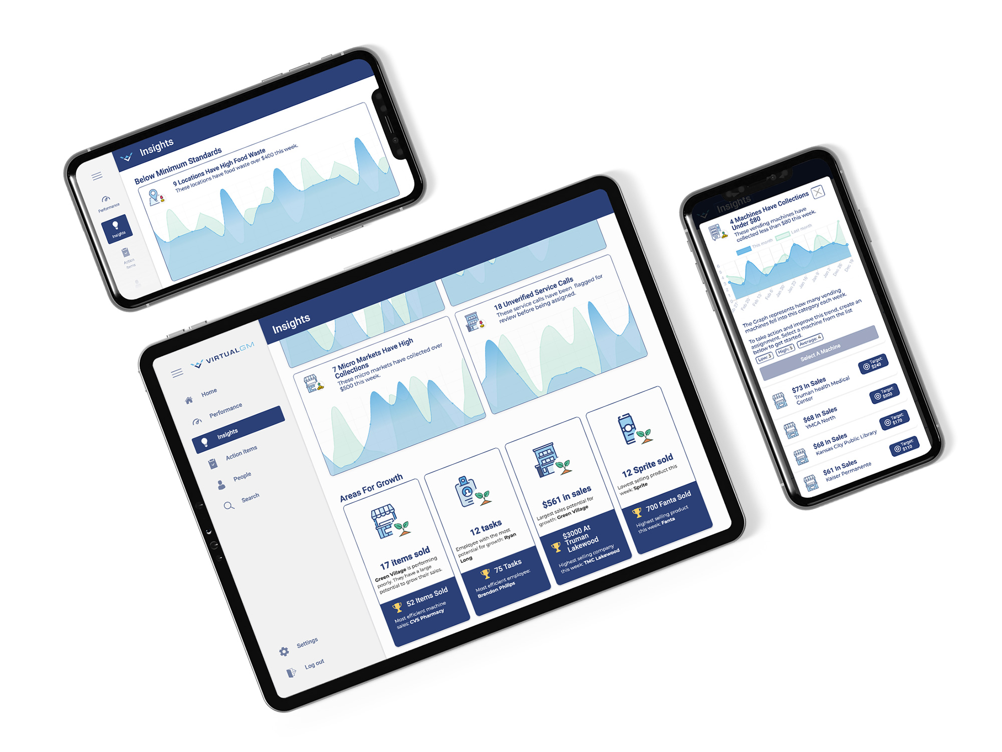
Artificial intelligence is used to monitor operations and suggest changes. After a trend is pointed out, supervisors can assign actions to team members. With time, Virtual GM learns what actions are assigned for each trend. The next time that trend is noticed, the system will suggest a task based on how supervisors handle that situation in the past. Virtual GM also estimates the profit from each action. These predictions help managers prioritize what to assign next.
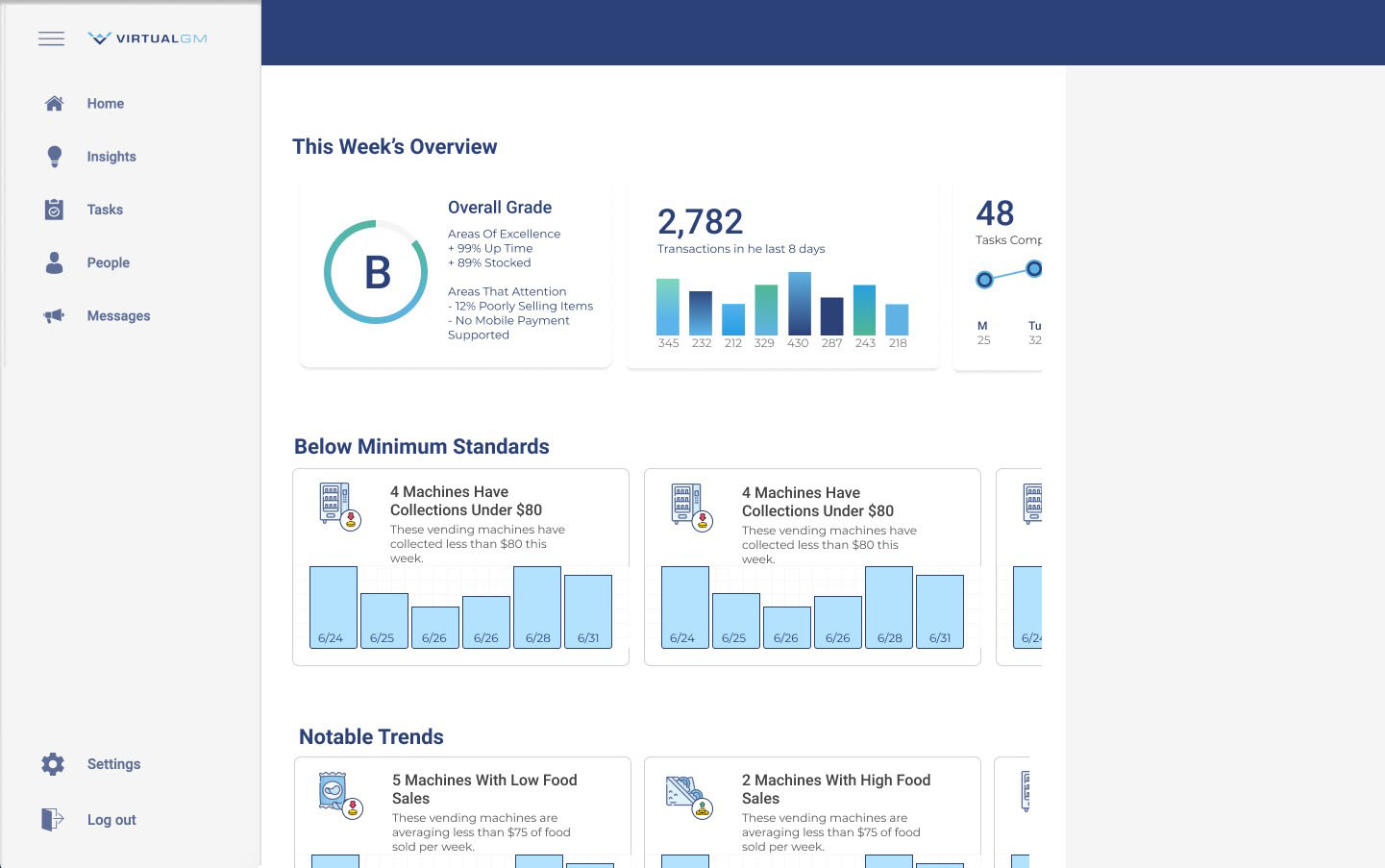
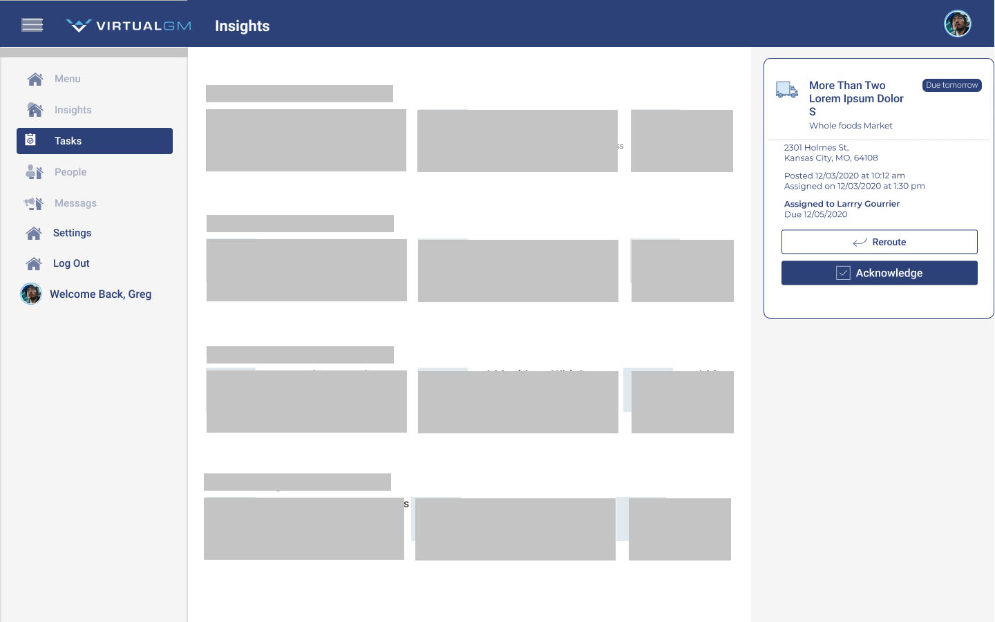
Home
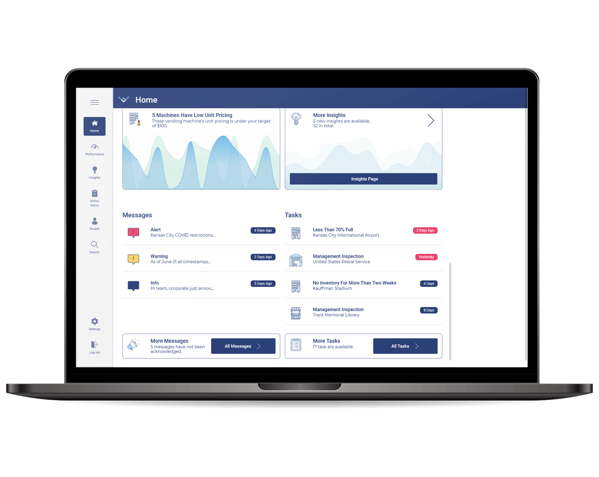
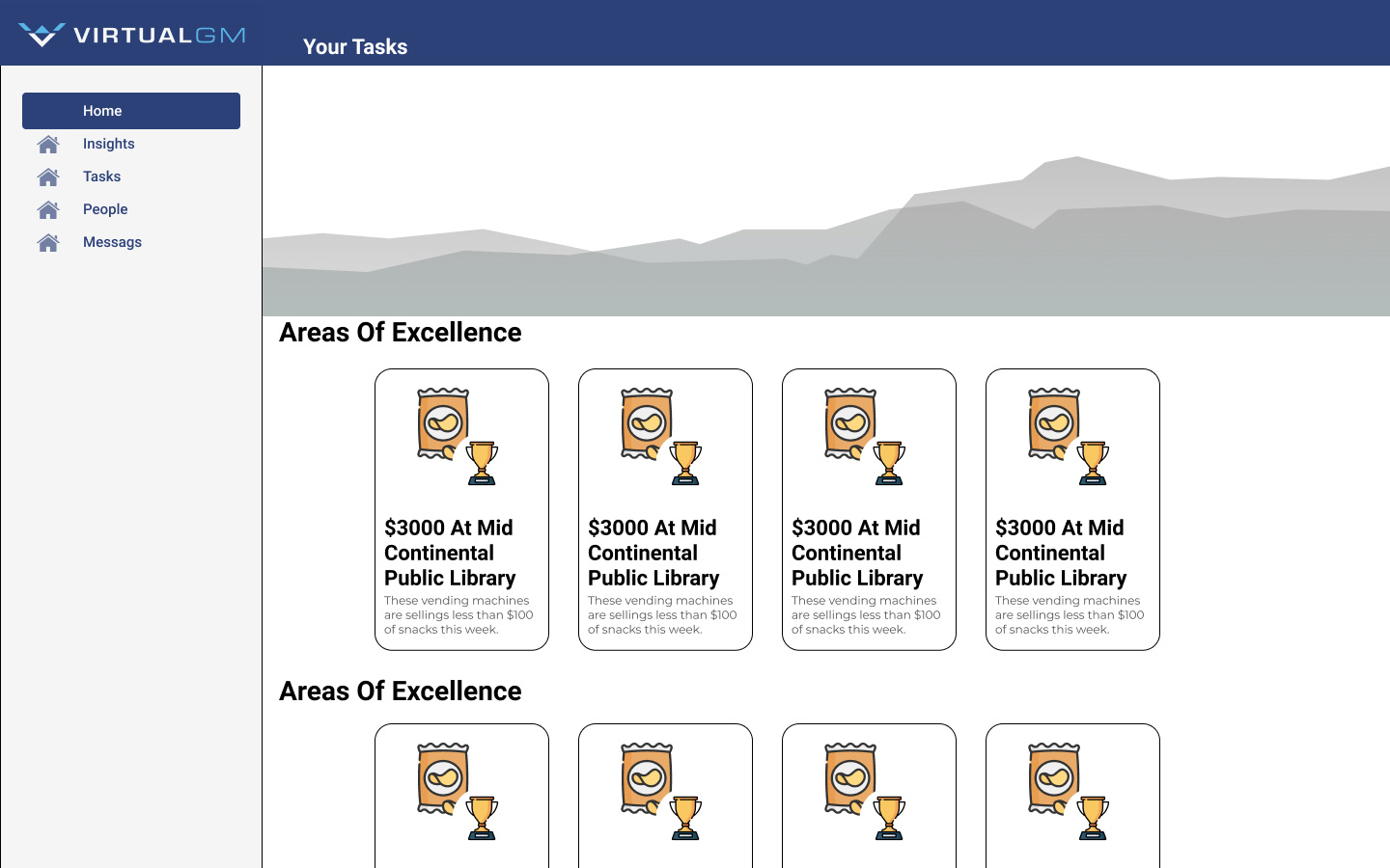
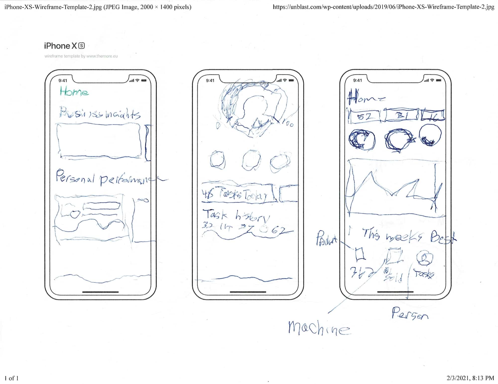
The homepage is designed to give business owners a finger on the pulse of their company. It shows an overview of company sales and trends. When employees log in, they are shown their revenue impact and are given a personal grade.
Managing People
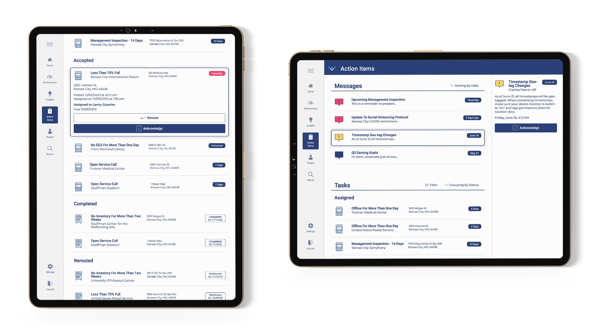
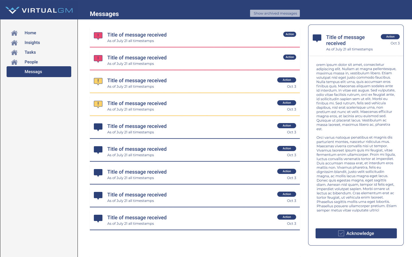
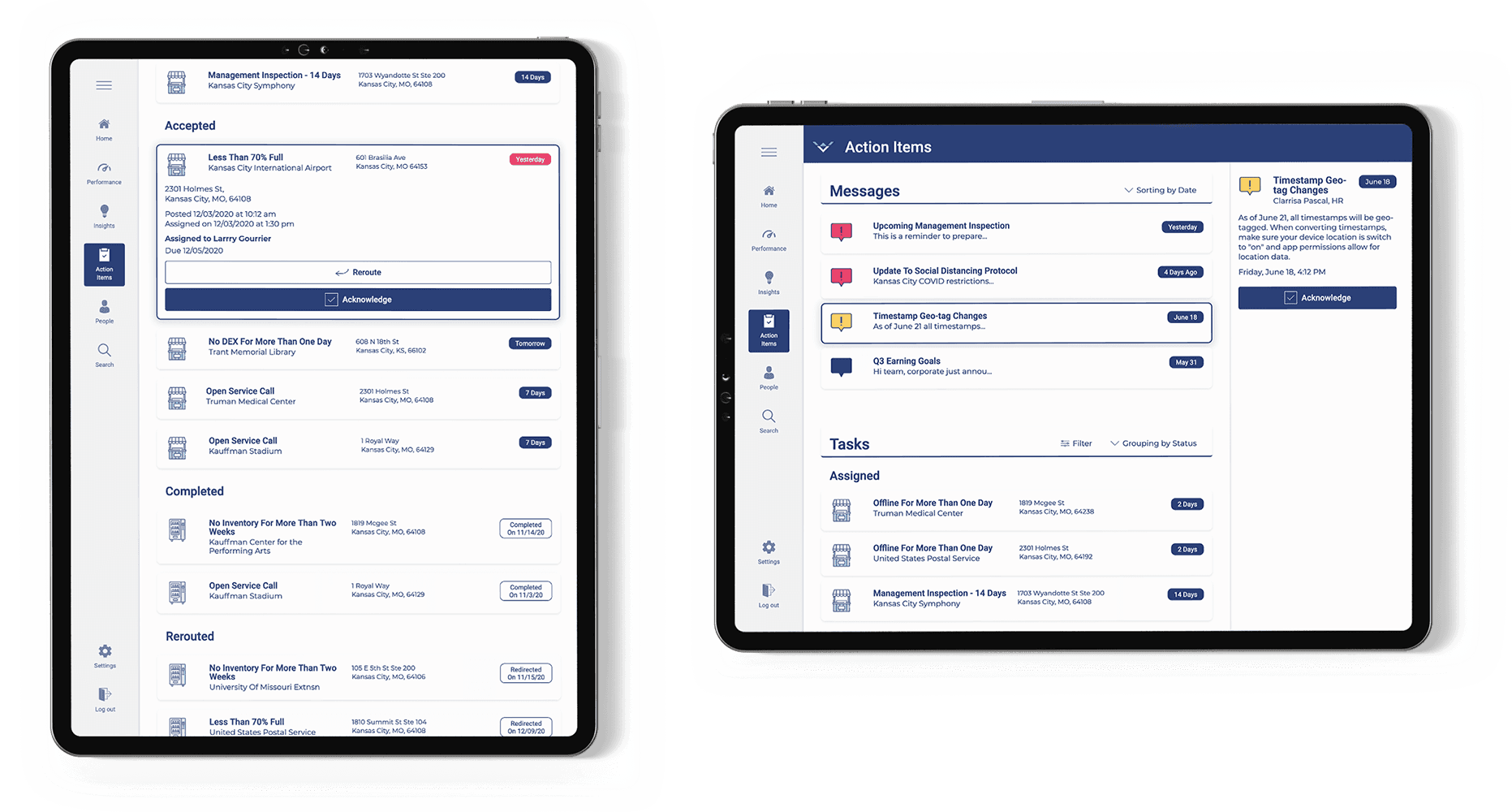
Action items are primarily for mid-level managers and their teams. The system will send out messages with automated alerts and updates. While messages are purely informational, tasks are real-world actions that maintain and improve the business. Much like tasks on the gig economy, small chunks of work are assigned to employees. When the task is complete, the team member will add a photo of their work and mark the task as complete. Employee behavior is then analyzed. Details on how many tasks are completed and when they are finished are given to that employee and their supervisor. Employees are shown what they are doing well and areas in which they can improve. Supervisors see which tasks have been finished and if any items are past due.
Navigation Bar
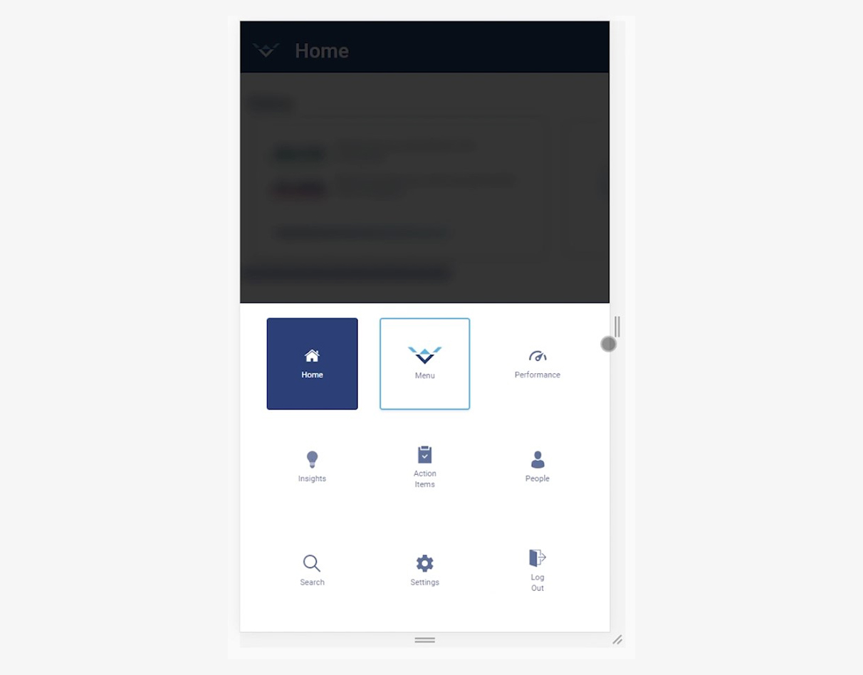
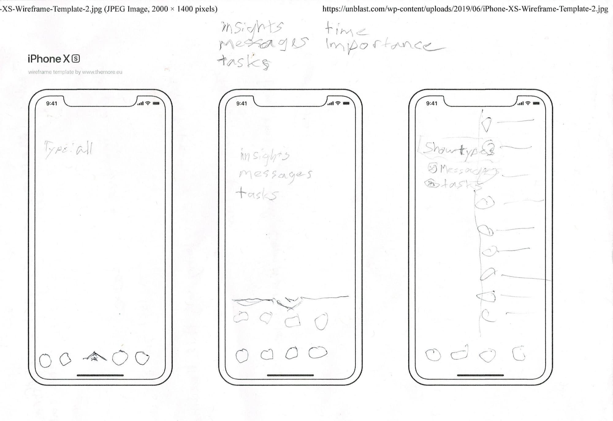
The responsive navigation bar was an important thing to get right in the early stages of this application. In the beginning, we had eight buttons on the menu. To Prepare for more menu options in the future, it needed to accommodate up to twenty buttons. As more pages are added, users will need to scroll down the list to find what they are looking for. I noticed many other applications also use a scrolling menu. A common design flaw is these menus do not communicate that the user can scroll down. The only way of knowing to scroll down is to be familiar with the application and remember there are more buttons out of sight. To avoid this mistake, we added a fade to the menu list, showing users they can scroll down to see more options. The navigation bar has three states. It is fully expanded on desktops and collapses down for tablets. On mobile, the menu moves from the left side to the bottom of the page. Tapping the center button opens a tray with all the menu options presented. Each of these menus can be added to indefinitely.

